Why Zara should be an example to other companies

8

October

2020

No ratings yet.

Retailers nowadays extract a lot of value from the online activities of their customers. For instance, A/B testing can be used to check if changes to a website are actually resulting in a higher click-through rate or not. If you are an online retailer, this is obviously a great way of identifying what your client’s wishes are. However, if you are offering your products both online and offline, you should ask yourself if this should be the only way of figuring out what your client wants or why he or she wants it.

This is illustrated by the fashion retailer Zara. Zara is very well able to quickly turn their customer insights into new products. Their employees are trained to pick up customer comments and ideas that are proposed by customers in their stores. They can then communicate this to their manager who will upload this to a centralized system. If similar ideas are identified in this way, Zara will decide to actually design and make the product based on the customer’s input without the customer actually knowing it.

I think this concept could also be of great value to other companies, even if they do not produce products themselves. Reasons why a product is bought or sometimes even more important, why a customer decides to look elsewhere, may not always be captured in the best way using only online technology. A customer may tell a sales-man that he does not like a specific car he just tried because he does not like the fabric of the interior. This information would be hard to capture online. To give another example, a company selling electronic goods may pick up in one of their stores that multiple people decided to not buy a specific headphone because they did not think the headphone fits well. Such information can be hard or even impossible to capture online though it could be very valuable.

I think employees should be trained to pick these sings up. Moreover, just as important, an IT-system, which enables companies to actually capture, categorize and aggregate this data,  should be created. This combination, as demonstrated by Zara, could be of great value to companies that are trying to identify what their customer’s wishes are.

What do you think of this? Do you think offline interaction contains valuable information that cannot be retrieved from online activities? And should companies focus on gathering and categorizing this information?

Used source

The Secret of Zara’s Success: A Culture of Customer Co-creation

Please rate this

Why a simple dashboard is a good dashboard

7

October

2020

5/5 (1)

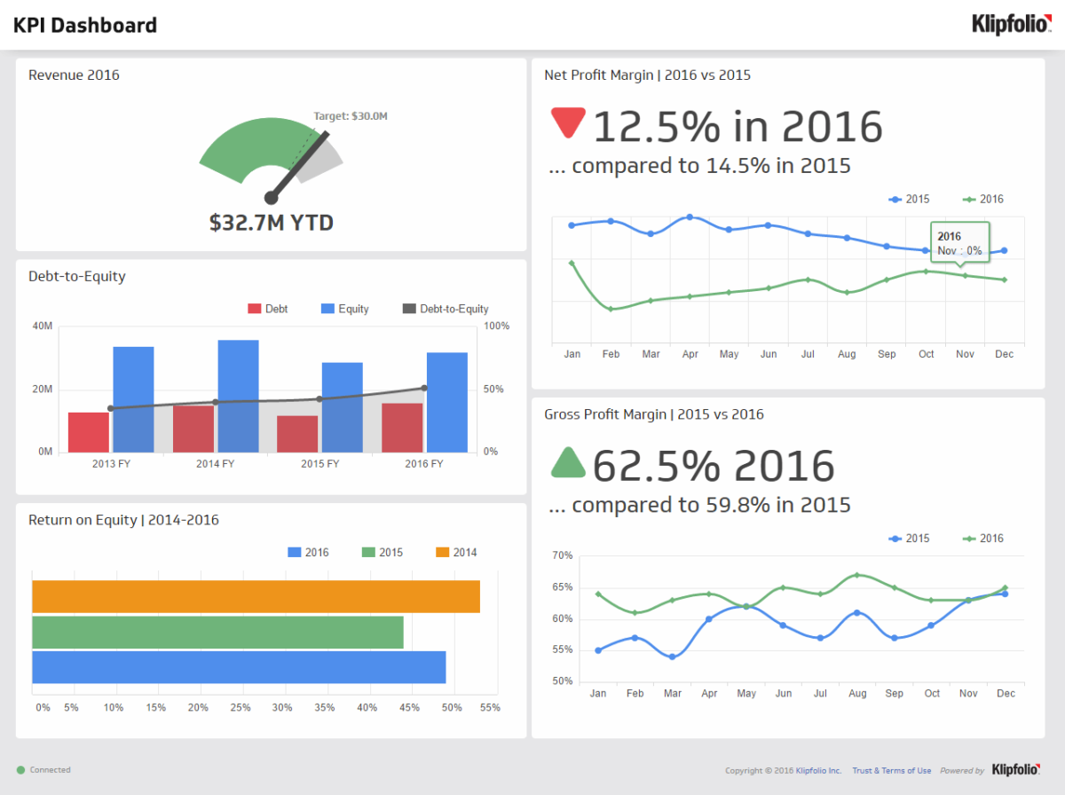
Over the years companies are relying more and more on the use of data in their decisions making processes. Raw data is often not suited for this, instead, various tools and types of analyses are used to provide a proper insight into the available data. One way of doing this is by using so-called business intelligence software such as Qlik or Microsoft’s PowerBI. This software can be used to create dashboards in which data is shown and aggregated in the form of KPI’s and visualized in objects like bar-charts and trend charts.

Starting with the visualization part, users are often amazed by the different functionalities and options BI-tools offer. They would like to add vibrant colors as backgrounds and add as many visualizations as possible in one overview. However, this is often not in line with the purpose of a dashboard. The purpose of such a dashboard is to help users get an insight into their data.  Having too much distraction in the form of less useful visualizations or useless colors in one overview will not properly convey the message the data is actually telling.

Having too much distraction is to some extent also applicable to the KPI’s that are shown in a dashboard. KPI’s are Key Performance Indicators and are supposed to give insight into how something is performing. Business users like to get insight into as much of the available data as possible. But the question that arises from this is; what are you actually going to do if all this data is aggregated and shown? If a KPI has no target or no comparisons based on dimensions such as date or geographical areas are made, there seems to be no actual argument for showing it. Looking at this in more detail,  even if a KPI would be compared based on for instance country but no action is taken if country A scores better than country B, it is not worth showing it. Showing “useless” KPI’s will, just like the visualization part, only result in a failure of conveying a message that is indeed useful to base decisions on.

To conclude, I personally think that a simple dashboard showing just the necessary information in a straightforward way is the most effective way of helping business users making the right decisions. What would be your opinion on this? Would you show information even though you are not going to act upon it? And, would you add various visualizations to convey the same message?

Please rate this