Fans of Hotel California by the Eagles will most likely recognise the famous last lines, which say: ‘You can check out any time you like. But you can never leave!’. While there are multiple interpretations on what this may refer to, this phrase can also be applied to how digital interfaces can be designed to make you do things that you did not want to do. Interface designers use all sorts of tricks to make sure that you, the user, is nudged into specific behavior which is beneficial for their purposes. Not convinced that this is actually true? Have you ever tried to cancel your subscription but you couldn’t find an easy way to do it? Or have you ever clicked a piece of normal looking content, only to find out that it was a disguised advertisement? These are all examples of dark patterns: design that is intentionally crafted in such a way that it is misleading or complex to perform certain tasks.
Case: Amazon’s Roach Motel
If you have ever tried to delete your Amazon account but gave up trying, I don’t blame you. The interface design of Amazon’s website has been intentionally crafted in such a way to discourage users into performing an action that hurts the company. Not only is the option buried deep in the website, it is also not located in an intuitive location. Take a look at the fragment below (0:19 – 1:41) to see the amount of hoops you have to go through.
Which dark patterns exist?
Harry Brignull is an expert in the field of user experience, who coined the term ‘dark patterns’ back in 2010. On his website, darkpatterns.org, he shares his findings of the types of dark patterns along with examples that you have probably already encountered at some point. Below a small overview of dark patterns which you are likely to come across:
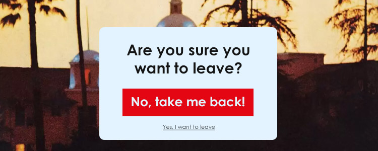
- Roach Motel: Just like the Hotel California, it is easy to get in – put near impossible to get out. The Amazon case is a good example of this dark pattern: signing up is very easy, but deleting your account is nearly impossible if you don’t know where to look.
- Bait and switch: When you expect a specific thing to occur, but something else occurs instead. Think of online stores luring you in with low prices, only to see that additional charges are applied in the checkout. Or Microsoft’s attempt to ‘misguide’ users into upgrading to Windows 10.
- Confirmshaming: Trying to guilt the user into a specific action, where the decline option is worded in such a way to shame the user. Think of wordings such as: ‘No thanks, I don’t want to benefit from this exclusive discount’.
What can we do about dark patterns?
As long as interface designers are able to nudge users into the behavior of their liking, dark patterns will most likely never cease to exist. Though, there is hope. According to Harry Brignull, the best weapon against dark patterns is to be aware of the presence of such patterns and to shame the companies who use them. LinkedIn, for example, has settled a lawsuit for $13 million for utilising dark patterns to trick users into inviting their network to the platform. While in practise this only implied a mere 10 dollars for every user affected, it does show that there is awareness of such malpractices.
References
https://www.youtube.com/watch?v=kxkrdLI6e6M
https://blog.ionixxtech.com/how-to-avoid-dark-patterns-in-ux/
https://www.darkpatterns.org/types-of-dark-pattern